The ownCloud Design System – Phoenix Makes Frontend Development Easy
Whether you want to write an app or a theme for ownCloud, the ownCloud Design System for the new Phoenix frontend is a great toolbox. How can you get started? An overview:
To make the development process more transparent, there is an update on the new Phoenix frontend. We already told you how to write an app of your own for Phoenix – this time it’s about the ownCloud Design System, the new framework for giving Phoenix a nice look and feel.
You can use it for making both apps and themes; you just need to touch different parts of the ownCloud Design System. This article will give you an overview, so you know where to start.
Phoenix is still work in progress. But you can use vueJS to display components, which are based on UIkit. The ownCloud Design System already defines several useful components. Let’s take a look at them:
The Interactive ownCloud Design System Documentation
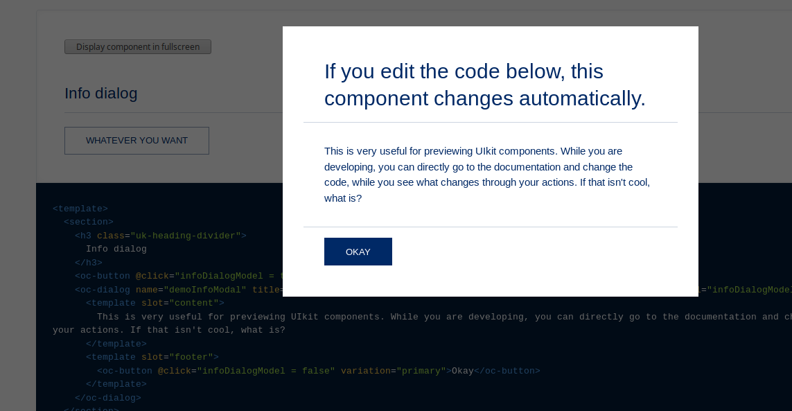
One great thing about the ownCloud Design System is that the documentation is interactive. It explains how it works and shows how to use the components in your app. At the same time you can preview the components and their design.
Best take a look at it yourself. You can preview the elements here: https://owncloud.github.io/owncloud-design-system/#/Elements
Note that this is still work in progress; as of the time of this writing, some of the texts are still missing. On the other hand, it updates itself automatically when new components are added to the ownCloud Design System.
UIkit Components – the Atomic Design Approach
With Phoenix, all the components of the web interface can be dynamically ordered. You can easily decide what you want to have where, by placing the components where they belong in your vueJS code.
These components are based on UIkit components. They follow the principles of atomic design for frontend development, so we have elements, patterns, templates, and pages. To start with the smallest unit, elements:
Elements – the Atoms of Phoenix
Elements are basic items which can be used in many ways; think of them as the atoms of the web interface. Menu items, file icons, search bars, warning messages, confirmation buttons, and all the other stuff a webpage needs – they are elements.
You can implement them easily wherever you need them. They will automatically follow the general look of the page. To get an overview what you can use them for, just take a look at the Pages.
If you need to get into the details, you might need the elements. But most of the time, you will not need that level of detail. Instead, the patterns might be all you wish for:
Patterns – Molecular Components
Patterns are groups of elements; like in molecules, in patterns you have all the necessary elements already ordered in a useful way. An example is the top bar, the side menu, and other screens which belong to the default furniture of any webpage
This way you don’t have to implement each single element on its own – you can reuse groups of elements. Because of this, many parts in Phoenix will look similar, and users can find their way even if they use an app they haven’t used before.
If something does not entirely fit your requirements, just tinker your own! You can take the example patterns as a model, and change them until it fits your need.
Templates – Organisms of Patterns
Templates define the layout and structure of a section. This is where you order the patterns you need to build a reusable page. The whole organism is defined here – should your page have arms and a head? Should it be able to walk, and does it need legs for it?
With templates you can put the components of your app where you need them, and where the user will see them later.
Pages – so be it, Amen
When your templates are filled with content, you can see a page. This is where arms, legs, and head come together to form the beautiful Wolpertinger you imagined. You should render a few pages to test whether your templates make the content actually look good.
The documentation mentioned above is a good example of it – you can see the pages directly rendering the code. If you build it locally, you can change every aspect of it and see how different it looks.
That’s it! Those are all the tools you need to create the layout of your ownCloud app in Phoenix.
Design Tokens – my Kingdom for a Theme
So now you know everything for creating an app layout – but what about the looks? In Phoenix, themes take care of the design. This has the advantage that on one ownCloud instance, every app looks the same.
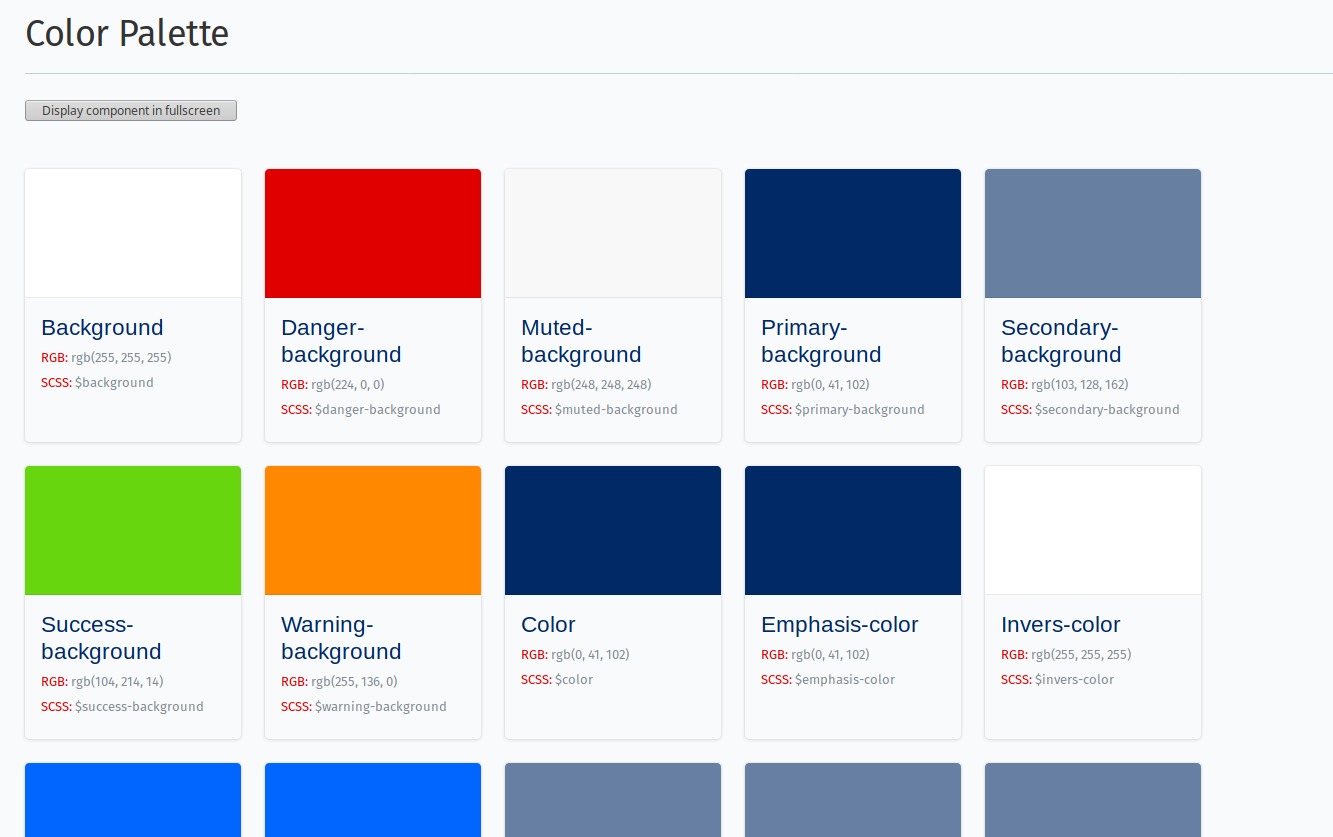
Design tokens are where the theming happens – app developers won’t need it, but if you write a Phoenix theme, this is where you change colors, fonts, and icons.

You can choose from these colors for your components – or create a theme with your own favorite colors.
The design tokens are SCSS variables which define how components look like application-wide. When you want to choose one of them for your component, you can preview the look in the documentation.
They also include the icons. The ownCloud Design System provides an abundant set of icons already – but if you want different icons, just ship your own and use them in the design token class.
No need to make it more complicated – with themes, you can concentrate on designing instead of worrying about architecture.
Intrigued? Try it Out!
To start designing, you need an app of your own of course. Fortunately, getting started with Phoenix app development is really easy. This blogpost is a great start:
Write an ownCloud app for the new Phoenix frontend!
Did you like this blogpost? Do you have further questions? Leave something in the comments below or share this article on social media!


